
I love colour. Putting together unusual combinations of different shades is a joy. Naturally then, I have a board on Pinterest dedicated to some of my favourite palettes, and I thought I’d share a few that might inspire you.
First up is the one I am using as inspiration for my wedding this summer (I’m throwing in a bit of rose pink too, and toning down the yellow in that first row to make it a more neutral grey-based cream):
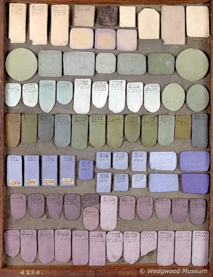
Perfectly pastel via Wedgewood Museum
This next one has a similar feel. I love how the shadows and faded patches give the colours texture and depth and stop them looking manufactured:
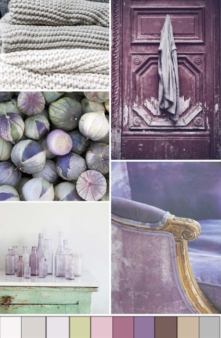
Faded beauty via Vecco Studio
These minty shades look great in a high gloss finish, contrasted against the grainy clay:
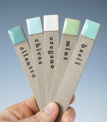
Earthbound mint via Paulova
This combination of aqua, jade, grey, cream and various browns shows how you can use brights without being overbearing – the result is vibrant yet grown up:
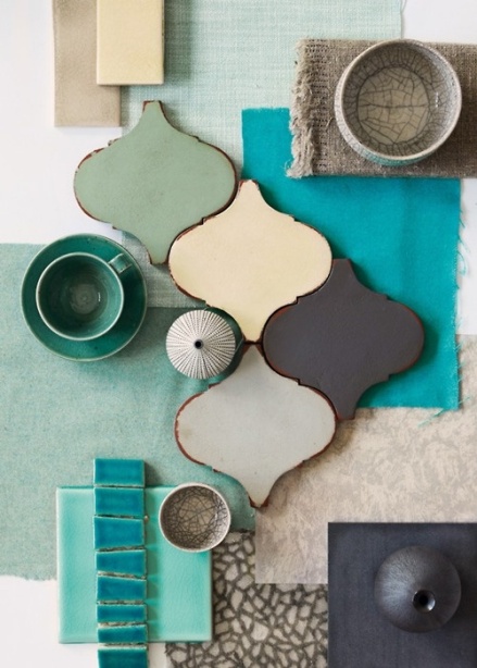
Moroccan glaze
This palette runs the retro gauntlet from the 40s to the 80s, using coral and mint, brown and yellow, and a splash of vibrant neon pink – groovy!
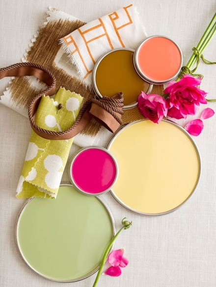
Retro rose
Finally, you can’t talk about colour palettes without mentioning Jessica Colaluca of Design Seeds. If you’ve not visited the site before, I insist you do so immediately. This stunning cherry palette is one of hundreds she has created. Prepare to fall in love:
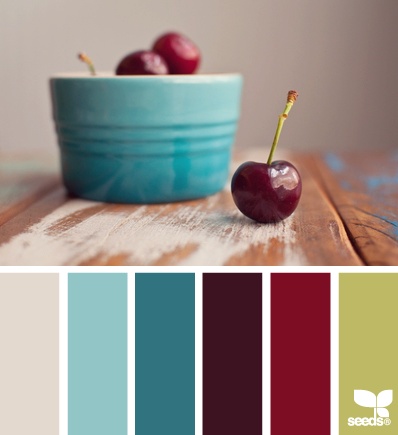
Rich and fruity via Design Seeds
